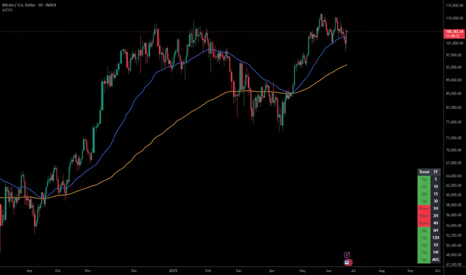
Multi-Timeframe Trend IndicatorMulti-Timeframe Trend Indicator
The “Multi-Timeframe Trend Indicator” is a versatile tool designed to help traders identify trends across multiple timeframes using Exponential Moving Averages (EMAs). This indicator is suitable for both novice and experienced traders. It allows users to customize the lengths of the short and long EMAs, providing a clear visualization of the trend direction (UP, DOWN, SIDE) for various intervals including 1 minute, 5 minutes, 15 minutes, 30 minutes, 1 hour, and 4 hours. The indicator offers extensive customization options, enabling adjustments for table position, colors, and more to suit individual trading preferences.
How the Calculation Works
The Multi-Timeframe Trend Indicator uses EMAs to calculate trends. EMAs give more weight to recent prices, making them responsive to new information. The short EMA, calculated over a shorter period, reacts quickly to price changes, while the long EMA, calculated over a longer period, smooths out fluctuations to show the overall trend.
For each timeframe, the indicator calculates both the short EMA and the long EMA. If the short EMA is above the long EMA, the trend is considered “UP”. If the short EMA is below the long EMA, the trend is “DOWN”. If the absolute difference between the short and long EMAs is within a user-defined threshold, the trend is classified as “SIDE” (sideways).
This calculation is repeated for multiple timeframes: 1 minute, 5 minutes, 15 minutes, 30 minutes, 1 hour, and 4 hours. The results are displayed in a table, providing a comprehensive view of the trend direction across different timeframes.
How the Code Works
Input Parameters: Users can input the lengths of the short and long EMAs and the threshold for identifying sideways trends. These inputs allow for a high degree of customization to match individual trading strategies.
Trend Calculation Function: The trend function calculates the trend direction based on the EMAs. It uses the math.abs function to find the absolute difference between the EMAs and determines if the trend is “UP”, “DOWN”, or “SIDE” based on the threshold.
Requesting Data for Multiple Timeframes: The script uses the request.security function to fetch price data and calculate the EMAs for different timeframes independently of the current chart timeframe. This ensures consistency in trend analysis regardless of the displayed timeframe.
Creating and Updating the Table: A table is created to display the trend directions for each timeframe. The table’s position and appearance can be customized. The trend data for each timeframe is color-coded (green for UP, red for DOWN, gray for SIDE) and displayed in the table.
Customization Options: Users can customize the colors, table position, and EMA lengths through the indicator settings, providing flexibility to adapt the indicator to their trading style.
Disclaimer
This indicator is for informational purposes only and should not be considered financial advice. It does not predict future price movements and does not guarantee accurate trend calculations, as market conditions can vary. Trading involves substantial risk and is not suitable for everyone. Always conduct your own research before making any trading decisions.
Search in scripts for "Up down"

Perfect Order Alert USDJPY/BTCUSD/XAUUSDPerfect Order Alert USDJPY/BTCUSD/XAUUSD 日本語解説は下記
This indicator detects the perfect order of three moving averages and displays on the Panel in an easy-to-understand visual manner whether there is an uptrend, downtrend, or non-trend for each time leg.
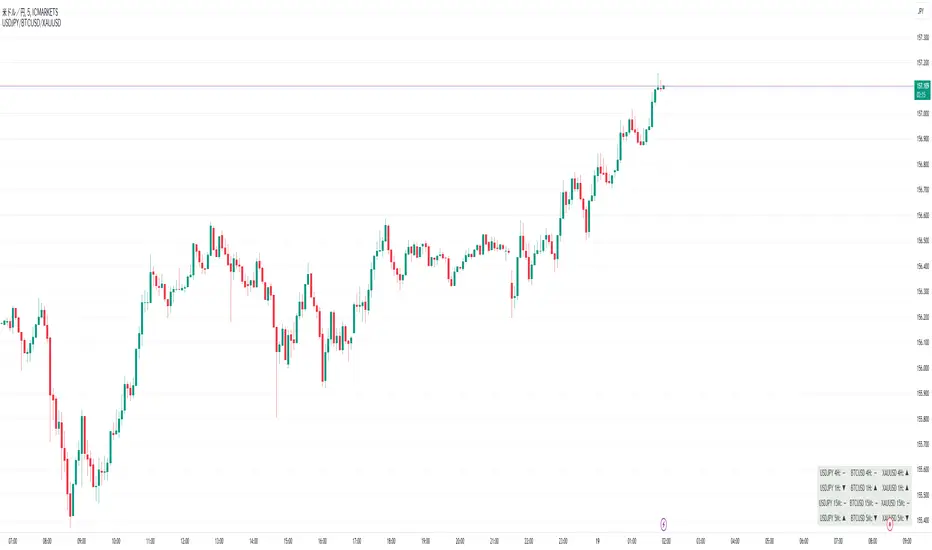
This indicator detects perfect orders for the three currency pairs USDJPY/BTCUSD/XAUUSD on the 5-minute, 15-minute, 1-hour, and 4-hour time frames, and displays them on the Panel on the chart, with “▲” for up, “▼” for down, and “ー” for non-trend, so that you can quickly determine the trend. The panel is displayed on the chart.
In order to check for perfect orders without missing them, it is also possible to set up alerts that notify you of all the time frames and currency pairs as well.
Functions
Displaying 4H, 1H, 15M, 5M, up (▲), down (▼), other (-), of USDJPY/BTCUSD/XAUUSD on the panel.
*(By default, 20EMA, 75EMA, and 200EMA are hidden.)
Display position setting of the panel (You can choose from upper left, upper top, upper right, lower left, lower bottom, or lower right).
Panel color and text color change function
The moving average line can be hidden by default.
Moving average period change
Moving average color and thickness can be changed.
EMA/SMA switchable
Alert function - One alert can be set for each currency pair and time frame ▲▼, which is very useful.
Perfect Order Alert
You can use it even if you have a free account with only one alert setting.
To use the alert function, go to the Tradingview default alert settings, select “USDJPY/BTCUSD/XAUUSD” for the top item of conditions, and select “Call Alert() function” in the frame just below it!
_* Supplementary explanation: ____________
Please note that due to the limitation of the script, only 3 currency pairs and 4 time frames are displayed with 12 items (Panels for currency pairs other than USDJPY/BTCUSD/XAUUSD are also created, but they are indicators for other scripts, so if you are interested in other currency pairs, please use those. If you are interested in other currency pairs, please use them.)
Please note that we may change the functions or delete the indicator itself without prior notice.
Translated with DeepL.com (free version)
Reference image of the setting screenReference image of the setting screen
設定画面参考画像
3本の移動平均線のパーフェクトオーダーを検知し、時間足ごとに上昇トレンドか下降トレンドかノントレンドかを視覚的にわかりやすくPanelに表示するインジゲーターです。
このインジゲーターは、USDJPY/BTCUSD/XAUUSDの3通貨ペアの5分足、15分足、1時間足、4時間足のパーフェクトオーダーを検知して、チャートに表示されるPanelに、上昇は「▲」下降は「▼」ノントレンドは「ー」と、すぐに判断できる表示にしてあります。
パーフェクトオーダーを逃さずチェックできるように、それぞれの時間足や通貨ペアも全てを通知してくれるアラート設定が可能なのも特徴です。
機能紹介
・USDJPY/BTCUSD/XAUUSDの4H,1H,15M,5M,の上昇(▲),下降(▼),その他(-),をパネルに表示
※(デフォルトでは20EMA,75EMA,200EMAの3本で非表示にしてあります)
・パネルの表示位置設定(左上、上、右上、左下、下、右下、から選択できます。)
・パネルの色とテキスト色変更機能
・移動平均線表示非表示機能(デフォルトでは表示OFFにしてあります。)
・移動平均線期間変更
・移動平均線色と太さ変更
・EMA/SMA切り替え可能
・アラート機能ー1つのアラート設定で通貨ペアと時間足▲▼一つ一つを細かく教えてくれるので便利。
※パーフェクト オーダーアラート
無料アカウントで1つしかアラート設定できなくても使えます。
アラート機能はTradingviewデフォルトのアラート設定から、条件の一番上の項目を「USDJPY/BTCUSD/XAUUSD」選択、そのすぐ下の枠に「Alert()関数の呼び出し」を選択でOK!
_※ 補足説明____________
・スクリプトの制限の為、3通貨ペアと4つの時間足の12項目で表示させていますのでご了承ください
(USDJPY/BTCUSD/XAUUSD以外の通貨ペアのPanelも作成していますが別スクリプトのインジゲーターになりますので他の通貨ペアも興味がある方はそちらをお使いください)
・予告なしで機能の変更やインジゲーター自体の削除等行う事もあるかもなのでご了承ください。
DMI ForLoop [InvestorUnknown]Overview
This indicator utilizes the Directional Movement Index (DMI) combined with a for-loop to provide a robust trend analysis (ADX is not a part of this indicator).
Settings
DMI ForLoop Settings:
Start Length (a): The initial length for DMI calculation (inclusive).
End Length (b): The final length for DMI calculation (inclusive).
EMA Length (c): The length for the Exponential Moving Average applied to the DMI values, in order so smoothen the signal.
Signal Settings:
Signal Mode: Determines the mode of signal calculation. Options are "Fast", "Slow", "Thresholds Crossing", and "Fast Threshold". Default is "Fast".
1. Slow: is a simple crossing of the midline (0).
2. Fast: positive signal depends if the current "DMIema" is above "DMIema " or above 0.99, otherwise the signal is negative.
3. Thresholds Crossing: simple ta.crossover and ta.crossunder of the user defined threshold for Long and Short.
4. Fast Threshold: signal changes if the value of "DMIema" changes by more than user defined threshold against the current signal.
// Slow
dmicol1 = DMIema > 0 ? colup : coldn
// Fast
dmicol2 = DMIema > DMIema or DMIema > 0.99 ? colup : coldn
// Thresholds Crossing
var color dmicol3 = na
if ta.crossover(DMIema,longth)
dmicol3 := colup
if ta.crossunder(DMIema,shortth)
dmicol3 := coldn
// Fast Threshold
var color dmicol4 = na
if (DMIema > DMIema + fastth)
dmicol4 := colup
if (DMIema < DMIema - fastth)
dmicol4 := coldn
color dmicol = na
if sigmode == "Slow"
dmicol := dmicol1
if sigmode == "Fast"
dmicol := dmicol2
if sigmode == "Thresholds Crossing"
dmicol := dmicol3
if sigmode == "Fast Threshold"
dmicol := dmicol4
else
na
Functionality
The DMI ForLoop indicator calculates an array of DMI values over a specified range of lengths, then averages these values and applies an EMA for smoothing. The result is a dynamic trend indicator that adapts to market conditions.
DMI Calculation:
The indicator iterates through lengths from Start Length to End Length, calculating the positive and negative directional movement (DM) for each period and calculates the average of all the signals at the end. A custom function version of the DMI is used here in order to use DMI with "series" inputs.
// Function to calculate an array of DMI values over a range of lengths
DMIArray(a, b, c) =>
// Initialize an array to store DMI values, with size based on the range (b - a + 1)
var dmiArray = array.new_float(b - a + 1, 0.0)
// Loop through each length from a to b
for x = 0 to (b - a)
// Calculate the smoothing factor alpha for the current length
alpha = 1.0 / (a + x)
// Initialize variables for positive and negative DM
float plus = na
float minus = na
// Calculate the up and down movements
up = ta.change(high)
down = -ta.change(low)
// Determine the positive DM (plusDM)
plusDM = na(up) ? na : (up > down and up > 0 ? up : 0)
// Determine the negative DM (minusDM)
minusDM = na(down) ? na : (down > up and down > 0 ? down : 0)
// Calculate the smoothed positive DM using either SMA or EMA
plus := na(plus ) ? ta.sma(plusDM, (a + x)) : alpha * plusDM + (1 - alpha) * nz(plus )
// Calculate the smoothed negative DM using either SMA or EMA
minus := na(minus ) ? ta.sma(minusDM, (a + x)) : alpha * minusDM + (1 - alpha) * nz(minus )
// Determine the trend direction: 1 for positive trend, -1 for negative trend, 0 for no trend
trend = plus > minus ? 1 : plus < minus ? -1 : 0
// Store the trend value in the DMI array
array.set(dmiArray, x, trend)
// Calculate the average of the DMI array
dmiAvg = array.avg(dmiArray)
// Apply an EMA to the average DMI value
DMIema = ta.ema(dmiAvg, c)
// Return the DMI array, its average, and the EMA of the average
// Call the DMIArray function with the input parameters and assign the results to variables
= DMIArray(a, b, c)
This indicator is versatile and can be tailored to fit various trading/investing strategies by adjusting the input parameters and signal modes.

Buy-Sell Volume Bar Gauge [By MUQWISHI]▋ INTRODUCTION :
The Buy-Sell Volume Bar Gauge is developed to provide traders with a detailed analysis of volume in bars using a low timeframe, such as a 1-second interval, to measure the dominance of buy and sell for each bar. By highlighting the balance between buying and selling activities, the Buy-Sell Volume Bar Gauge helps traders identify potential volume momentum of a bar; aimed at being a useful tool for day traders and scalpers.
_______________________
▋ OVERVIEW:
_______________________
▋ METHODOLOGY:
The concept is based on bars from a lower timeframe within the current chart timeframe bar, where volume is categorized into Up, Down, and Neutral Volume, with each one displayed as a portion of a column plot. Up Volume is recorded when the price experiences a positive change, Down Volume occurs when the price experiences a negative change, and Neutral Volume is observed when the price shows no significant change.
_______________________
▋ INDICATOR SETTINGS:
(1) Fetch data from the selected lower timeframe. Note: If the selected timeframe is invalid (higher than chart), the indicator will automatically switch to 1 second.
(2) Price Source.
(3) Treating Neutral Data (Price Source) as
Neutral: In a lower timeframe, when the bar has no change in its price, the volume is counted as Neutral Volume.
Previous Move: In a lower timeframe, when the bar has no change in its price, the volume is counted as the previous change; “Up Volume” if the previous change was positive, and “Down Volume” if the previous change was negative.
Opposite Previous Move: In a lower timeframe, when the bar has no change in its price, the volume is counted as the opposite previous change; “Up Volume” if the previous change was negative, and “Down Volume” if the previous change was positive.
(4) Average Volume Length, it's used for lighting/darkening columns in a plot.
(5) Enable Alert.
(7) Total bought (%) Level.
(8) Total Sold (%) Level.
_____________________
▋ COMMENT:
The Buy-Sell Volume Bar Gauge can be taken as confirmation for predicting the next move, but it should not be considered a major factor in making a trading decision.

Taiwan Stock Limit Up/Down Calculator[fitfatq]1.Description:
This script is designed to calculate the limit up and limit down prices for Taiwan stock market securities based on the previous day's closing prices. It incorporates the specific tick size rules used in the Taiwan stock market to ensure accurate and compliant price adjustments.
2.Key Features:
Tick Size Rules:
The script applies different tick sizes depending on the price range of the stock, adhering to Taiwan stock market regulations. For example:
Price < 10: Tick size = 0.01
Price < 50: Tick size = 0.05
Price < 100: Tick size = 0.1
Price < 500: Tick size = 0.5
Price < 1000: Tick size = 1
Price >= 1000: Tick size = 5
Calculation Methodology:
Previous Close: The script retrieves the previous day's closing price.
Initial Limit Prices: It calculates the initial limit up and limit down prices by multiplying the previous close by 1.1 and 0.9, respectively.
Adjustments for Tick Size: The script adjusts these initial prices to the nearest valid price based on the defined tick size rules, ensuring that the adjusted prices do not cross tick size boundaries.
Adjustments to Prevent Crossing Tick Size Boundaries:
If the adjusted limit prices fall into a different tick size range, further adjustments are made to align with the appropriate tick size.
3.Usage:
This script is useful for traders and investors in the Taiwan stock market to quickly determine the limit up and limit down prices for any given security.
It is particularly beneficial for day traders and scalpers who need to know these critical price levels for their trading strategies.
4.How It Works:
The script uses the request.security function to get the previous day's close price.
It defines a function getTickSize to determine the appropriate tick size based on the stock price.
The adjustPrice function then adjusts the initial limit prices to conform to the tick size rules, ensuring accurate and regulatory-compliant limit prices.
Note: This script is closed-source, but it provides transparency in its methodology to help users understand the underlying calculations and how to utilize it effectively in their trading decisions.

Enhanced Volume by SR7SiddharthaRay007's Enhanced Volume Indicator works on any Timeframe
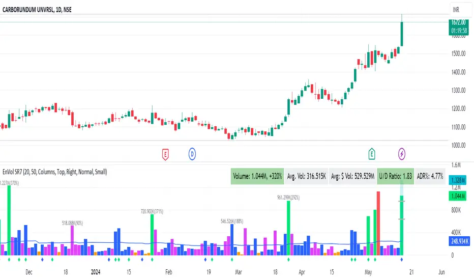
⦿ Volume Labels:
1. Current Volume, Volume Change%, Average Volume, Average Doller Volume, Up/Down Ratio, ADR%.
=>Average value can be changed using 'Lookback Length' (Default: 20)
⦿ Simple Moving Average: MA (Default: 50). Color of MA changes based on the up down volume ratio.
1. Up/Down Ratio > 1: Blue
2. Up/Down Ratio < 1: Orange
⦿ Volume Bar Colors:
1. High Relative Volume Positive Candle: Lime Green .
2. High Relative Volume Negative Candle: Red .
3. Normal Volume Positive Candle: Blue .
4. Normal Volume Negative Candle: Fuchsia .
5. Low Relative Volume Positive/Negative Candle: Orange .
=>High Relative Volume > 300% of Average Volume; Low Relative Volume < 30% of Average Volume
⦿ Pocket Pivot (A pocket pivot is an up day with volume greater than any of the down days volume in the past 10 days)
1. 10 day Pocket Pivots: Lime Green Diamond below volume bar
2. 5 day Pocket Pivots: Blue Diamond below volume bar
⦿ 'Highest Volume (HV) ' on top of the Volume Bar:
1. Highest Volume Ever (HVE)
2. Highest Volume in Over a Year (HVY)
⦿ Projected Volume Bar: Aqua
⦿ Plot a line at 2x and 3x Average Volume and set Alerts
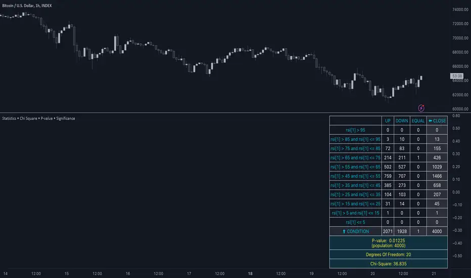
Statistics • Chi Square • P-value • SignificanceThe Statistics • Chi Square • P-value • Significance publication aims to provide a tool for combining different conditions and checking whether the outcome is significant using the Chi-Square Test and P-value.
🔶 USAGE
The basic principle is to compare two or more groups and check the results of a query test, such as asking men and women whether they want to see a romantic or non-romantic movie.
–––––––––––––––––––––––––––––––––––––––––––––
| | ROMANTIC | NON-ROMANTIC | ⬅︎ MOVIE |
–––––––––––––––––––––––––––––––––––––––––––––
| MEN | 2 | 8 | 10 |
–––––––––––––––––––––––––––––––––––––––––––––
| WOMEN | 7 | 3 | 10 |
–––––––––––––––––––––––––––––––––––––––––––––
|⬆︎ SEX | 10 | 10 | 20 |
–––––––––––––––––––––––––––––––––––––––––––––
We calculate the Chi-Square Formula, which is:
Χ² = Σ ( (Observed Value − Expected Value)² / Expected Value )
In this publication, this is:
chiSquare = 0.
for i = 0 to rows -1
for j = 0 to colums -1
observedValue = aBin.get(i).aFloat.get(j)
expectedValue = math.max(1e-12, aBin.get(i).aFloat.get(colums) * aBin.get(rows).aFloat.get(j) / sumT) //Division by 0 protection
chiSquare += math.pow(observedValue - expectedValue, 2) / expectedValue
Together with the 'Degree of Freedom', which is (rows − 1) × (columns − 1) , the P-value can be calculated.
In this case it is P-value: 0.02462
A P-value lower than 0.05 is considered to be significant. Statistically, women tend to choose a romantic movie more, while men prefer a non-romantic one.
Users have the option to choose a P-value, calculated from a standard table or through a math.ucla.edu - Javascript-based function (see references below).
Note that the population (10 men + 10 women = 20) is small, something to consider.
Either way, this principle is applied in the script, where conditions can be chosen like rsi, close, high, ...
🔹 CONDITION
Conditions are added to the left column ('CONDITION')
For example, previous rsi values (rsi ) between 0-100, divided in separate groups
🔹 CLOSE
Then, the movement of the last close is evaluated
UP when close is higher then previous close (close )
DOWN when close is lower then previous close
EQUAL when close is equal then previous close
It is also possible to use only 2 columns by adding EQUAL to UP or DOWN
UP
DOWN/EQUAL
or
UP/EQUAL
DOWN
In other words, when previous rsi value was between 80 and 90, this resulted in:
19 times a current close higher than previous close
14 times a current close lower than previous close
0 times a current close equal than previous close
However, the P-value tells us it is not statistical significant.
NOTE: Always keep in mind that past behaviour gives no certainty about future behaviour.
A vertical line is drawn at the beginning of the chosen population (max 4990)
Here, the results seem significant.
🔹 GROUPS
It is important to ensure that the groups are formed correctly. All possibilities should be present, and conditions should only be part of 1 group.
In the example above, the two top situations are acceptable; close against close can only be higher, lower or equal.
The two examples at the bottom, however, are very poorly constructed.
Several conditions can be placed in more than 1 group, and some conditions are not integrated into a group. Even if the results are significant, they are useless because of the group formation.
A population count is added as an aid to spot errors in group formation.
In this example, there is a discrepancy between the population and total count due to the absence of a condition.
The results when rsi was between 5-25 are not included, resulting in unreliable results.
🔹 PRACTICAL EXAMPLES
In this example, we have specific groups where the condition only applies to that group.
For example, the condition rsi > 55 and rsi <= 65 isn't true in another group.
Also, every possible rsi value (0 - 100) is present in 1 of the groups.
rsi > 15 and rsi <= 25 28 times UP, 19 times DOWN and 2 times EQUAL. P-value: 0.01171
When looking in detail and examining the area 15-25 RSI, we see this:
The population is now not representative (only checking for RSI between 15-25; all other RSI values are not included), so we can ignore the P-value in this case. It is merely to check in detail. In this case, the RSI values 23 and 24 seem promising.
NOTE: We should check what the close price did without any condition.
If, for example, the close price had risen 100 times out of 100, this would make things very relative.
In this case (at least two conditions need to be present), we set 1 condition at 'always true' and another at 'always false' so we'll get only the close values without any condition:
Changing the population or the conditions will change the P-value.
In the following example, the outcome is evaluated when:
close value from 1 bar back is higher than the close value from 2 bars back
close value from 1 bar back is lower/equal than the close value from 2 bars back
Or:
close value from 1 bar back is higher than the close value from 2 bars back
close value from 1 bar back is equal than the close value from 2 bars back
close value from 1 bar back is lower than the close value from 2 bars back
In both examples, all possibilities of close against close are included in the calculations. close can only by higher, equal or lower than close
Both examples have the results without a condition included (5 = 5 and 5 < 5) so one can compare the direction of current close.
🔶 NOTES
• Always keep in mind that:
Past behaviour gives no certainty about future behaviour.
Everything depends on time, cycles, events, fundamentals, technicals, ...
• This test only works for categorical data (data in categories), such as Gender {Men, Women} or color {Red, Yellow, Green, Blue} etc., but not numerical data such as height or weight. One might argue that such tests shouldn't use rsi, close, ... values.
• Consider what you're measuring
For example rsi of the current bar will always lead to a close higher than the previous close, since this is inherent to the rsi calculations.
• Be careful; often, there are na -values at the beginning of the series, which are not included in the calculations!
• Always keep in mind considering what the close price did without any condition
• The numbers must be large enough. Each entry must be five or more. In other words, it is vital to make the 'population' large enough.
• The code can be developed further, for example, by splitting UP, DOWN in close UP 1-2%, close UP 2-3%, close UP 3-4%, ...
• rsi can be supplemented with stochRSI, MFI, sma, ema, ...
🔶 SETTINGS
🔹 Population
• Choose the population size; in other words, how many bars you want to go back to. If fewer bars are available than set, this will be automatically adjusted.
🔹 Inputs
At least two conditions need to be chosen.
• Users can add up to 11 conditions, where each condition can contain two different conditions.
🔹 RSI
• Length
🔹 Levels
• Set the used levels as desired.
🔹 Levels
• P-value: P-value retrieved using a standard table method or a function.
• Used function, derived from Chi-Square Distribution Function; JavaScript
LogGamma(Z) =>
S = 1
+ 76.18009173 / Z
- 86.50532033 / (Z+1)
+ 24.01409822 / (Z+2)
- 1.231739516 / (Z+3)
+ 0.00120858003 / (Z+4)
- 0.00000536382 / (Z+5)
(Z-.5) * math.log(Z+4.5) - (Z+4.5) + math.log(S * 2.50662827465)
Gcf(float X, A) => // Good for X > A +1
A0=0., B0=1., A1=1., B1=X, AOLD=0., N=0
while (math.abs((A1-AOLD)/A1) > .00001)
AOLD := A1
N += 1
A0 := A1+(N-A)*A0
B0 := B1+(N-A)*B0
A1 := X*A0+N*A1
B1 := X*B0+N*B1
A0 := A0/B1
B0 := B0/B1
A1 := A1/B1
B1 := 1
Prob = math.exp(A * math.log(X) - X - LogGamma(A)) * A1
1 - Prob
Gser(X, A) => // Good for X < A +1
T9 = 1. / A
G = T9
I = 1
while (T9 > G* 0.00001)
T9 := T9 * X / (A + I)
G := G + T9
I += 1
G *= math.exp(A * math.log(X) - X - LogGamma(A))
Gammacdf(x, a) =>
GI = 0.
if (x<=0)
GI := 0
else if (x
Chisqcdf = Gammacdf(Z/2, DF/2)
Chisqcdf := math.round(Chisqcdf * 100000) / 100000
pValue = 1 - Chisqcdf
🔶 REFERENCES
mathsisfun.com, Chi-Square Test
Chi-Square Distribution Function
Price Action Toolkit | Flux Charts💎 GENERAL OVERVIEW
Introducing our new Price Action Toolkit indicator! Price Action Toolkit integrates key level strategy , traditional supply-demand analysis , and market structures to help traders in their decisions. Now with features that are available to use in multiple timeframes!
Features of the new Price Action Toolkit indicator :
Volumized Fair Value Gaps (FVGs)
Volumized Order & Breaker Blocks
Identification of Market Structures
Equal Highs & Lows
Buyside & Sellside Liquidity
Premium & Discount Zones
MTF Highs & Lows (Daily, Weekly, Monthly, Pre-Market)
Customizable Settings
📌 HOW DOES IT WORK ?
We believe that the analytical elements that are within this indicator work best when they co-exist with each other on the chart. Trading often requires taking multiple elements into consideration for better accuracy on market analysis. Thus, we combined some of the useful strategies in one indicator for ease of use.
1. Volumized Fair Value Gaps
Fair value gaps often occur when there is an imbalance in the market, and can be spotted with a specific formation on the chart.
The volume when the FVG occurs plays an important role when determining the strength of it, so we've placed two bars on the FVG zone, indicating the high & low volumes of the FVG. The high volume is the total volume of the last two bars on a bullish FVG, while the low volume is - of the FVG. For a bearish FVG, the total volume of the last two bars is the low volume. The indicator can also detect FVGs that exist in other timeframes than the current chart.
2. Volumized Order Blocks
Order blocks occur when there is a high amount of market orders exist on a price range. It is possible to find order blocks using specific formations on the chart.
The high & low volume of order blocks should be taken into consideration while determining their strengths. The determination of the high & low volume of order blocks are similar to FVGs, in a bullish order block, the high volume is the last 2 bars' total volume, while the low volume is the oldest bar's volume. In a bearish order block scenerio, the low volume becomes the last 2 bars' total volume.
3. Volumized Breaker Blocks
Breaker blocks form when an order block fails, or "breaks". It is often associated with market going in the opposite direction of the broken order block, and they can be spotted by following order blocks and finding the point they get broken, ie. price goes below a bullish order block.
The volume of a breaker block is simply the total volume of the bar that the original order block is broken. Often the higher the breaking bar's volume, the stronger the breaker block is.
4. Market Structures
Sometimes specific market structures form and break as the market fills buy & sell orders. Formed Change of Character (CHoCH) and Break of Structure (BOS) often mean that market will change direction, and they can be spotted by inspecting low & high pivot points of the chart.
5. Equal Highs & Lows
Equal Highs & Lows occur when there is a significant amount of difference between a candle's close price and it's high / low value, and it happens again in a specific range. EQH and EQL usually mean there is a resistance that blocks the price from going further up / down.
6. Buyside & Sellside Liquidity
Buyside & Sellside Liquidity zones are where most traders place their take-profits and stop-losses in their long / short positions. They are spotted by using high & low pivot points on the chart.
7. Premium & Discount Zones
The premium zone is a zone that is over the fair value of the asset's price, and the discount zone is the opposite. They are formed by the latest high & low pivot points.
8. MTF Highs / Lows
MTF Highs / Lows are actually pretty self-explanatory, you can enable / disable Daily, Weekly, Monthly & Pre-Market Highs and Lows.
🚩UNIQUENESS
Our new indicator offers a comprehensive toolkit for traders, combining multiple analytical elements with customizable settings to aid in decision-making across different market conditions and timeframes. The volumetric information of both FVGs and Order & Breaker Blocks will be present in your chart to serve you greater detail about them. The indicator also efficiently identifies market structures, liquidity zones and premium & discount zones to give you an insight about the current state of the market. And finally with the use of multiple timeframes , you can easily take a look at the bigger picture. We recommend reading the "How Does It Work" section of the descripton to get a better understanding about how this indicator is unique to others.
⚙️SETTINGS
1. General Configuration
Show Historic Zones -> This will show historic Fair Value Gaps, Order & Breaker Blocks and Sellside & Buyside liquidities which are expired.
2. Fair Value Gaps
Enabled -> Enables / Disables Fair Value Gaps
Volumetric Info -> The volumetric information of the FVG Zones will be rendered if activated.
Zone Invalidation -> Select between Wick & Close price for FVG Zone Invalidation.
Zone Filtering -> With "Average Range" selected, algorithm will find FVG zones in comparison with average range of last bars in the chart. With the "Volume Threshold" option, you may select a Volume Threshold % to spot FVGs with a larger total volume than average.
FVG Detection -> With the "Same Type" option, all 3 bars that formed the FVG should be the same type. (Bullish / Bearish). If the "All" option is selected, bar types may vary between Bullish / Bearish.
Detection Sensitivity -> You may select between Low, Normal or High FVG detection sensitivity. This will essentially determine the size of the spotted FVGs, with lower sensitivies resulting in spotting bigger FVGs, and higher sensitivies resulting in spotting all sizes of FVGs.
3. Order Blocks
Enabled -> Enables / Disables Order Blocks
Volumetric Info -> The volumetric information of the Order Blocks will be rendered if activated.
Zone Invalidation -> Select between Wick & Close price for Order Block Invalidation.
Swing Length -> Swing length is used when finding order block formations. Smaller values will result in finding smaller order blocks.
4. Breaker Blocks
Enabled -> Enables / Disables Breaker Blocks
Volumetric Info -> The volumetric information of the Breaker Blocks will be rendered if activated.
Zone Invalidation -> Select between Wick & Close price for Breaker Block Invalidation.
5. Timeframes
You can set and enable / disable up to 3 timeframes. Note that only higher timeframes than the current chart will work.
6. Market Structures
Break Of Structure ( BOS ) -> If the current structure of the market is broken in a bullish or bearish direction, it will be displayed.
Change Of Character ( CHoCH ) -> If the market shifts into another direction, it will be displayed.
Change Of Character+ ( CHoCH+ ) -> This will display stronger Change Of Characters if enabled.
7. Equal Highs & Lows
EQH -> Enables / Disables Equal Highs.
EQL -> Enables / Disables Equal Lows.
ATR Multiplier (0.1 - 1.0) -> Determines the maximum difference between highs / lows to be considered as equal. Lower values will result in more accurate results.
8. Buyside & Sellside Liquidity
Zone Width -> Determines the width of the liquidity zones, 1 = 0.025%, 2 = 0.05%, 3 = 0.1%.
9. Premium & Discount Zones
Enabled -> Enables / Disables Premium & Discount Zones.
10. MTF Highs / Lows
You can enable / disable Daily, Weekly, Monthly & Pre-Market Highs and Lows using this setting. You can also switch their line shapes between solid, dashed and dotted.

NSE METRICS Public [ILuvMarkets]This indicator supports the following NSE wide metrics derived from EOD BHAVCOPY.
UP/DOWN VOLUME
UP/DOWN TRADED VALUE
ADVN/DCLN
4% UP/DOWN
NEW HIGHS/LOWS 20D
NEW HIGHS/LOWS 50D
NEW HIGHS/LOWS 100D
NEW HIGHS/LOWS 200D
The metrics can be displayed as NET ( UP - DOWN), ACTUAL VALUE (UP vs. DOWN) or a PERCENTAGE ( UP / (UP + DOWN))
Please use Daily Timeframe for these metrics.
The metrics are updated by an EOD Batch process once NSE BHAVCOPY is available.

Volume Wizard - Omkar
Volume bars on up days will be in 'silver' colour.
Volume bars on down days will be in 'grey' colour.
The volume bar will ‘be red’ in colour if the latest close is below the previous close and the volume is more than the average volume.
A green circle will be plotted if the current candle volume is the least in the last 20 days.
The volume bar will be ‘blue’ in colour if the current candle volume is more than the highest volume of the down day in the last 5 days (5-day Pocket Pivot).
The volume bar will be ‘green’ in colour if the current candle volume is more than the highest volume of the down day in the last 10 days (10-day Pocket Pivot).
The volume bar will be ‘lime’ in colour if the current candle volume is more than the highest volume of the down day in the last 20 days (20-day Pocket Pivot).
The volume bar will be ‘teal’ in colour if the current candle volume is highest in the last 3 months.
The volume bar will be ‘aqua’ in colour if the current candle volume is highest in the last 1 year.
If the current volume is the lowest in the last 22 days, a tiny yellow circle will be plotted on the volume average line on daily and weekly timeframe only.
If the current volume is more than three times the average volume and the close is in the top half of the candle, a diamond will be plotted at the top of the volume bar on a daily and weekly timeframe only.
Average volume days and Pivot lookback period can be modified.
The table shows the average turnover, the number of pocket pivots in the last ‘n’ days and the up-down ratio.
The table position can be changed.
Volume Wizard - Omkar indicator provides me with insights, allowing me to make informed trading decisions, and identify potential trends.
It's my go-to companion for navigating the financial markets with confidence.
Add it to your favourites and start using it right away.
Happy trading!
Supply Demand Profiles [LuxAlgo]The Supply Demand Profiles is a charting tool that measures the traded volume at all price levels on the market over a specified time period and highlights the relationship between the price of a given asset and the willingness of traders to either buy or sell it, in other words, highlights key concepts as significant supply & demand zones, the distribution of the traded volume, and market sentiment at specific price levels within a specified time period, allowing traders to reveal dominant and/or significant price levels and to analyze the trading activity of a particular user-selected range.
In other words, this tool highlights key concepts as significant supply & demand zones, the distribution of the traded volume, and market sentiment at specific price levels within a specified time period, allowing traders to reveal dominant and/or significant price levels and to analyze the trading activity of a particular user-selected range.
Besides having the tool as a combo tool, the uniqueness of this version of the tool compared to its early versions is its ability to benefit from different volume data sources and its ability to use a variety of different polarity methods, where polarity is a measure used to divide the total volume into either up volume (trades that moved the price up) or down volume (trades that moved the price down).
🔶 USAGE
Supply & demand zones are presented as horizontal zones across the selected range, hence adding the ability to visualize the price interaction with them
By default, the right side of the profile is the volume profile which highlights the distribution of the traded activity at different price levels, emphasizing the value area, the range of price levels in which the specified percentage of all volume was traded during the time period, and levels of significance, such as developing point of control line, value area high/low lines, and profile high/low labels
The left side of the profile is the sentiment profile which highlights the market sentiment at specific price levels
🔶 DETAILS
🔹 Volume data sources
The users have the option to select volume data sources as either 'volume' (regular volume) or 'volume delta', where volume represents all the recorded trades that occur at a given bar and volume delta is the difference between the buying and the selling volume, that is, the net demand at a given bar
🔹 Polarity methods
The users are able to choose the methods of how the tool to take into consideration the polarity of the bar (the direction of a bar, green (bullish) or red (bearish) bar) among a variety of different options, such as 'bar polarity', 'bar buying/selling pressure', 'intrabar (chart bars at a lower timeframe than the chart's) polarity', 'intrabar buying/selling pressure', and 'heikin ashi bar polarity'.
Finally, the interactive mode of the tool is activated, as such users can easily modify the intervals of their interest just by selecting the indicator and moving the points on the chart
🔶 SETTINGS
The script takes into account user-defined parameters and plots the profiles and zones
🔹 Calculation Settings
Volume Data Source and Polarity: This option is to set the desired volume data source and polarity method
Lower Timeframe Precision: This option is applicable in case any of the 'Intrabar (LTF)' options are selected, please check the tooltip for further details
Value Area Volume %: Specifies the percentage for the value area calculation
🔹 Presentation Settings
Supply & Demand Zones: Toggles the visibility of the supply & demand zones
Volume Profile: Toggles the visibility of the volume profile
Sentiment Profile: Toggles the visibility of the sentiment profile
🔹 Presentation, Others
Value Area High (VAH): Toggles the visibility of the VAH line and color customization option
Point of Control (POC): Toggles the visibility of the developing POC line and color customization option
Value Area Low (VAL): Toggles the visibility of the VAL line and color customization option
🔹 Supply & Demand, Others
Supply & Demand Threshold %: This option is used to set the threshold value to determine supply & demand zones
Supply/Demand Zones: Color customization option
🔹 Volume Profile, Others
Profile, Up/Down Volume: Color customization option
Value Area, Up/Down Volume: Color customization option
🔹 Sentiment Profile, Others
Sentiment, Bullish/Bearish: Color customization option
Value Area, Bullish/Bearish: Color customization option
🔹 Others
Number of Rows: Specify how many rows the profile will have
Placment: Specify where to display the profile
Profile Width %: Alters the width of the rows in the profile, relative to the profile range
Profile Price Levels: Toggles the visibility of the profile price levels
Profile Background, Color: Fills the background of the profile range
Value Area Background, Color: Fills the background of the value area range
Start Calculation/End Calculation: The tool is interactive, where the user may modify the range by selecting the indicator and moving the points on the chart or can set the start/end time using these options
🔶 RELATED SCRIPTS
Volume-Profile
Volume-Profile-Maps
Volume-Delta

Apeiron Fair Value Bands ProWHAT IS IT
The Apeiron Fair Value Bands Pro is an indicator that estimates the fair value area of an asset and provides levels of interest and likely reaction. It was created to determine fair value. Knowing fair value allows traders and investors to determine when an asset is at a premium or at a discount, which allows them to make more informed decisions about when to buy or sell. Fair value is constantly changing, and sometimes waiting for it to develop each session or month can lead to missed opportunities. Therefore, it is useful to have an estimate of fair value at all times.
HOW DOES IT WORK?
The simplest way to have a constant estimation of fair value could probably be a Moving Average. By averaging previous prices, we get the average price which ideally reflects where most traders have been interested in participating in the market. This isn’t necessarily the most accurate fair value estimation you can get, however using different types of moving averages and combining them allows for a better estimation of the FV. It is also important to consider that price is always moving away and back into the MA, so in order to determine FV, we must allow an area for price to move within which we can consider the FVA. By taking into account volatility, previous relevant levels and the MA, the Apeiron Bands determine a FVA, where in theory price should stay most of the time.
According to the normal distribution, the price should stay within 1 standard deviation (SD) around 68% of the time and within 2 SD around 95% of the time during range periods (when data is most symmetrical). In the case of the Apeiron Bands, based on backtest data, the price tends to stay within 1 FVA around 75% of the time, within 2 FVA around 90% of the time during strong trends, around 80% and 95% correspondingly during weak trends, and >85% and >95% during ranges.
Additionally, based on backtesting data, pivots occur on average at around 1 FVA ±0.05 (This does not necessarily mean that most pivots occur at 1 FVA, however, the fact the average is 1±0.05 implies there is relevance to this level).
Finally, in order to account for volatility and the slight differences between symbols, a customizable tolerance ribbon is added to the moving average (MA) and each plotted band.
This data remains the same throughout all timeframes and types of market (tested on cryptocurrencies, forex pairs, stocks, indices and futures)
Examples of the time spent within the FVAs:
Examples of average pivot FVA :
HOW TO USE IT?
Identify potential reversal levels at premium and discount prices:
Knowing that price stays within 1 FVA the majority of time and inside 2 FVA most of the time, as well that in average pivots occur around 1 FVA, it can be inferred that both the Bands representing 1 & 2 FVA (B1 & B2) work as potential reversal levels as shown in the examples. This can be very good in confluence with other strategies to spot trade entries. If this is done taking into account if the asset is at a premium or discount allows for a higher probability of being on the right side of the market.
For example, during an uptrend price sometimes goes below it’s MA only to then continue up. In this particular case, the bands would provide an ideal entry at a discount to ride the uptrend.
During ranges, the bands can be used to identify potential pivots for each move up and down, and because of their adaptive nature they can be a great confluence to which horizontal levels are more likely to act as support and resistance.
For intraday traders, the bands can help them identify assets at one of the extremes and potentially even inside one of the bands, indicating that price is likely to reverse from there. Then they can use LTF to find ideal entries or catch the trend with the bands.
For swing traders and investors, using the bands can be a good way to scan different assets to find extended prices to either side and potential entry levels
Identify emerging trends:
Sometimes price will have a minimum reaction to the bands or no reaction at all. Knowing that price spends most of the time inside the bands, the fact that it breaks out of the FVA indicates that a new trend is likely to begin on that particular TF and price will try to establish a new FVA. Once there is a sustained PA outside the bands, a new trend can be assumed (Deviations happen as well, so it is very important to be aware of higher TF as well).
Other times, price will start sliding between B1 and B2, slowly displacing the MA. This can also be an indication for the start of a trend.
Identify exhaustions (potential tops & bottoms):
I call exhaustions to scenarios when price keeps going up/down but it fails to keep pushing the FVA with it. This indicates weakness in the trend and that a new FVA is being established. This often leads to a potential reversal or correction that marks the top or bottom of a move. Not only that, but when the new FVA is established price tends to go and test the other side of the FVA. Identifying exhaustions and being patient for them to form can potentially provide a great entry and RR ratio.
Exhaustions also happen after strong rallies or crashes, and in these cases it is advised to wait for price to re-enter its FVA, providing more clarity and often even better entries.
Exhaustions appear in all timeframes and symbols, however they can take some time to develop and it is important to be patient with them. And as always, it is highly recommended to also check for confluence on different TF.
8H Bands:
4H Bands:
Additional Features:
- Additional Bands:
The Apeiron Fair Value Bands can plot up to 4 Bands. Each fully customizable. The preset and suggested use is to have B1 & B2 and add thinner aid bands B0.5 & B1.5 which represent the middle of 1 & 2 FVA. These are not the main levels of interest but they can prove useful as support and resistance many times. Besides using mid levels, using fib values (0.618 & 1.618) can work even better on some assets and give better reactions.
NATGAS 1H Bands - Fib Mids:
The extra bands can also be used for FVA 3 and FVA 4, which can be useful during extremely volatile periods or on very LTF
- Multi Timeframe & precision:
The bands work on very low TF as well as High TF. Sometimes data can be limited on HTF and the bands will not have enough to be calculated and many LTF are very volatile and don’t work as well. In these scenarios, the bands have a setting called “Precision” under the preferences section that allows the user to decrease or increase the amount of data taken into account. This allows for optimization on any TF and even on any symbol.
GOLD 1min Bands:
EURUSD 5D Bands:
VIX 1H Bands:
- Multi Bands Confluence:
Combining 2 different length FV bands can be very useful to find confluence levels and spot trends and reversals earlier. For example, on the 15 min TF, using a 50 MA with only 1 FVA at the same time as a 200 MA with all Band can be ideal to keep track of short term moves and their micro-trends while always considering the longer trend which might be different that the short term one. As well, having MTF band confluence can indicate that a level is more likely to signal a reversal if reached.
- Multi Timeframe Confluence:
One of the best ways to use the bands is by using it in confluence with itself in other TFs, when price moves sharply into a confluent level given by multiple TFs’ Bands, it is more likely for price to find support and resistance and/or reverse there. Ex. 5 Min B2, 15 Min B1.5 & 30 Min B1, if price reaches this confluent level and shows weakness, this is likely a short term reversal level.
NATGAS MTF Bands:
How to set it up and customize it: (Explain how they are important)
- The MA Lab:
The Apeiron Bands utilizes a MA Lab to generate the most customizable MAs possible. It allows combining up to 3 different MAs, where each MA can be single, double or triple (same process as creating a DEMA or TEMA). As well each MA can be given more or less weight in the calculation of the final MA. Besides it’s features, the MA Lab allows the user to select only one MA and stick to basic settings and MA types if preferred.
When to use the MA Lab:
If you wanted a reactive MA (EMA) which was also volume weighted, you can then combine it with a VWMA and get a VW-EMA.
If you want a more reactive VWMA you can double or triple it. Then in order to make it smoother you combine it with a SMMA. Finally maybe you want to use it to follow trends closely so you also combine it with a HMA to take momentum into consideration.
- Presets:
The multiplier for each band, the width of each tolerance ribbon and the individual colors of each band can all be individually selected. However, to make the user's experience as smooth as possible, FVA multipliers, Ribbon width and colors can be preset and modified all at the same time with the most basic and ideal settings. This allows for quick customization options as well as personalized detailed custom settings.
- Show only Lower or Upper bands:
This setting is meant for scouting for discounts and premiums across the board. By only showing bands on one side it cleans up the chart and makes it easier to spot important levels on only one side of the price. This can be very useful when looking for swing opportunities or when following a particular trend to only focus on potential entries for it.
MATIC 4H Bands showing only bottom bands:
AMZN 1D Bands showing only bottom bands:
Settings used in indicator preview:
- Custom MA: 200 EMA/200 WMA/200 SMMA (200 EWSMMA)
- Band 1: 0.5 - Ribbon Width: 5 - Color: Blue
- Band 2: 1 - Ribbon Width: 10 - Color: Green
- Band 3: 1.5 - Ribbon Width: 5 - Color: Blue
- Band 4: 2 - Ribbon Width: 10 - Color: Red
Disclaimer:
The bands CAN but are NOT meant to be used as a standalone indicator. Previous performance does not guarantee future performance. The bands are an analytical tool, not a signal indicator. While certain scenarios can be interpreted as a signal, never follow them blindly and always use them in confluence with other analysis, systems or indicators.
MTF Smart Money ConceptsOverview
This indicator displays major elements of Smart Money Concepts and price action trading with multi-timeframes(MTF) and layered market structures with color visualization.
What is Smart Money Concepts?
Smart Money Concepts(SMC) is one of the methodologies to interpret how financial market moves and to analyze it and execute trades, focusing on liquidity and order flow of financial institutions.
Smart money means the funds invested by large financial institutions such as banks, institutional traders/investors, market makers, hedge funds etc. contrary to retail traders/investors' money.
It is important to note that there is no proof or evidence that those institutions move the market as described in Smart Money Concepts.
Personally speaking, it is one of the interpretation of the market and another angle to view the market just like other technical analysis methodologies such as Elliott Wave Principle, Gann Theory, Wyckoff Method and even traditional price action trading.
Importance of MTF Analysis
MTF analysis(a.k.a Topdown analysis) is the foundation to technically analyze charts and the most fundamental skill in trading because lower timeframes are always influenced by upper timeframes where large financial institutions operate.
How to use
This indicator is designed to help traders analyze how the market moves in terms of SMC and price action with multi-timeframes and color visualization of the market structures, which makes this indicator unique and different from other indicators.
There is two key settings that you can use based on your trading style.
1.Upper timeframe selection
You have two options to determine upper timeframe; Auto mode and Manual mode.
When Auto mode selected, upper timeframe will be determined based on chart timeframe as follows.
Chart timeframe => Upper timeframe
1M=>15M
5M/15M=>1H
30M/1H=>4H
4H=>D
D=>W
W=>M
If you select Manual mode, you can fix an upper timeframe.
2.High/low settings
This affects all other settings of the indicator and most importantly designs the market structure.
This is the key setting to determine how you view the market as price action trading is all about highs and lows and story of how highs and lows have been created with the market structure.
You can specify left bars and right bars to identify swing highs/lows and these highs/lows become the basis to design the market structure and determine how SMC elements are displayed.
Example:
Left bar&right bar: 10
You can see bigger wave(magenta line) in the market structure(stepped line).
(Magenta line is a drawn object by manual)
Left bar&right bar: 4
With this setting, you can see smaller wave in the market structure.
Since market moves like wave as there is a lot of wave theories in financial investment/trading industry such as Elliott wave, Wolf wave etc., users can define market structure with this setting depending on what degree of wave they aim to trade.
Functions:
MTF Order Block
Concept
Order block is a block of orders where buying orders and selling orders are accumulated. Order blocks are created when the institutions move the market up and down, temporality placing orders in an opposite direction to the way they want to move, in order to match their own orders with counter-orders.
Visualization by the indicator
The indicator displays both chart timeframe's order blocks and upper timeframe's order blocks(MTF).
You can also select from two options how to display order blocks;
1. Show all order blocks
2. Show strong order blocks only
Note: Strong order blocks mean order blocks created at strong highs/lows. See also strong high/low below.
Alerts can be set when prices reach strong order blocks.
MTF Fair Value Gap(FVG)/Imbalance
Concept
Fair Value Gap(FVG)(Imbalance) is a void generated among three consecutive candlesticks.
FVG(s) is created when the market moves so rapidly generating buy side or sell side order imbalances.
FVG(s) is characterized by price action that prices tend to come back to the area where FVG(s) exists, filling in the space among the candlesticks.
Visualization by the indicator
The indicator displays both chart timeframe's FVG and upper timeframe's FVG.
MTF Liquidity Grab
Concept
Liquidity grab is price action to sweep liquidity for the institutions to move the market.
This price action often happens because the size of their orders is so huge and they need a bunch of counter-orders to match their orders. This is why prices sometimes come to areas where liquidity rest and swipe them before the market goes up/down.
Liquidity visualization
Where does liquidity rest?
The answer is above highs(buy side liquidity) and below lows(sell side liquidity).
Among all highs and lows, swing highs and lows are where liquidity is accumulated the most because swing highs and lows can be created only by the institutions, therefore massive liquidity is indicated.
Visualization by the indicator
The indicator displays liquidity dots so that users can easily identify where liquidity rests and liquidity grab of both a chart timeframe and an upper timeframe.
Alerts can be set when liquidity grab happens.
MTF Strong High/Low
Concept
Strong high/low literally means strong highs and lows among all highs and lows including swing highs and lows.
There is a few different definitions of strong high/low in price action trading and the definition in this indicator is as follows.
Strong high
A high that that breaks higher low or lower low
Strong low
A low that breaks lower high or higher high
Visualization by the indicator
The indicator displays strong highs and lows of both a chart timeframe and an upper timeframe.
MTF Market Structure Visualization
Concept
Market structure is a series of price movement with highs and lows which outlines the way the market directs. It is a basis to see trend occurrence, trend reversal and sideways and analyzing the market structures in multi-timeframes is the most fundamental technical skill in trading/investment.
Visualization by the indicator
The indicator displays market structures of both a chart timeframe and an upper timeframe and provide color visualization depending on bullish and bearish market structures.
The definition of bullish and bearish market structure is as follows.
Bullish market structure
When a price breaks a Lower High or Higher High
Bearish market structure
When a price breaks a Higher Low or Lower Low
Settings
All the functions above, colors and line settings are parameterized and can be turned on/off depending on users’ needs.
———————————————————————————
概要
Smart Money Concepts(SMC)およびプライスアクショントレードにおける重要な要素をマルチタイムフレームで表示することのできるインジケーターです。
相場構造(Market structure)をマルチタイムフレームで表示し、相場構造の強弱を色で可視化することができます。
Smart Money Concepts(スマートマネーコンセプト)とは?
Smart Money Concepts(以下SMC) は金融市場がどのように動くかを解釈し、分析し、取引を執行するための相場理論の一つであり、Liquidity(リクイディティ)および機関投資家のオーダーフロー(注文の流れ)に焦点を置いていることが特徴です。
Smart Money(スマートマネー)とは、銀行や機関投資家、マーケットメーカー、ヘッジファンドといった金融機関が動かす資金を意味し、個人投資家の資金と対をなす概念です。
重要な点は、実際に上記の金融機関がSmart Money Conceptsで語られているような相場の動かし方をしているかどうかを証明する明確なエビデンスはないということです。
個人的には、エリオット波動理論やギャン理論、ワイコフ理論、伝統的なプライスアクショントレーディングの方法論と同様に、マーケットの動きを解釈するための一つの方法論であり、マーケットの動きを別の角度から見る枠組みと捉えています。
マルチタイムフレーム(MTF)分析の重要性
MTF分析はチャートをテクニカルに分析する上での基礎であり、トレードにおいて最も重要なスキルです。なぜなら下位のタイムフレームは上記のような金融機関が資金運用を行う上位のタイムフレームの影響を常に受けるためです。
使い方
このインジケーターは、SMCまたはプライスアクショントレードの観点から、トレーダーがマーケットをマルチタイムフレームで分析することを支援するために開発しています。
相場構造(Market structure/マーケットストラクチャー)を方向性に応じて色で可視化することができるため、視覚的に相場の構造を判断できることがこのインジケータのユニークな点であり、他のインジケーターと異なる点です。
ユーザーのトレードスタイルに応じて、以下の二つの設定を行うことができます。
1.上位足の決定方法
ユーザーは上位足のタイムフレームを決定するにあたり、AutoモードとManualモードを選択することができます。
Autoモードを選択した場合、上位足はチャートのタイムフレームに応じて以下のように決定されます。
チャートタイムフレーム => 上位足タイムフレーム
1M=>15M
5M/15M=>1H
30M/1H=>4H
4H=>D
D=>W
W=>M
Manualモードを選択すると上位足のタイムフレームを固定することができます。
2.High/low(高値/安値) 設定
当設定はインジケーターの他の全ての機能に影響し、また最も重要である相場構造の定義に影響します。
当設定はユーザーがマーケットをどのように見るか(=どの程度の粒度)を決定する重要な設定です。なぜならプライスアクショントレードは、高値、安値とそれらが相場構造をどのように構築してきたかの一連の流れを分析することが全てだからです。
ユーザーは相場構造を決定付けるスイングハイ·スイングローを特定するためのバーの本数を設定することができます。ここで設定した内容が、相場構造を定義し、以下で説明するSMCの要素の表示を決定することになります。
例:
Left bar&right bar(左右のバーの数): 10
この場合、ステップラインで示した相場構造の中に大きな波(マゼンタの波)を見ることができます。
(マゼンタのラインは手動で描いたオブジェクト)
Left bar&right bar: 4
この設定では、上記に比べて小さい波を描いていることが確認できます。
相場理論の中にエリオット波動理論やウォルフ波動といった数多くの波動理論があることからわかるように、相場は波として動きます。どの粒度の波を狙うかというトレーダーのスタイルに応じて、設定を変更することができます。
機能
MTFオーダーブロック
コンセプト
オーダーブロックとは買い注文と売り注文が一連となって蓄積されたオーダー(注文)のブロックのことです。
オーダーブロックは機関投資家が相場を動かす際に、本来意図する方向とは一時的に逆に動かすことで、彼ら自身の注文をマッチングさせるための反対注文を発生させることで形成されます。
インジケーターによる表示
インジケーターはチャートタイムフレームのオーダーブロックと上位足のオーダーブロックの両方を表示することができます。
また、オーダーブロックの表示オプションとして、
1.全てのオーダーブロックを表示
2.Strong(ストロング)オーダーブロックのみを表示
を選択することが可能です。
注: StrongオーダーブロックはStrong High/Lowで形成されるオーダーブロックを指します。(下記参照)
また、オーダーブロック到達でのアラート設定も可能です。
MTFフェアーバリューギャップ(FVG)/インバランス
コンセプト
フェアーバリューギャップ(FVG)/インバランスとは連続する3つのローソク足の間に形成される溝(Gap)のことです。
フェアーバリューギャップはマーケットが非常に早く動いたことにより、買いオーダーと売りオーダーの需給バランスが崩れることによって発生します。
フェアーバリューギャップには、価格がフェアーバリューギャップが発生したエリアまで戻ってくる傾向があるという特徴が存在します。
インジケーターによる表示
インジケーターはチャートタイムフレームのフェアーバリューギャップと上位足のフェアーバリューギャップの両方を表示することができます。
MTF Liquidity Grab(リクイディティ·グラブ)
コンセプト
Liquidity(リクイディティ)とはマネー、つまり注文です。
Liquidity Grab(リクイディティ·グラブ)とは、機関投資家がマーケットを動かす際にLiquidityを取得するプライスアクションのことを指します。
このプライスアクションは、機関投資家が処理する注文サイズが非常に大きいため、自身の注文を出す際に大量の反対注文を必要とすることからしばしば発生します。
これが、価格がLiquidity(注文)の集まっているエリアに接近し、それら注文をスワイプ(狩り取る)した後に上昇·下落する理由です。
Liquidityの可視化
一般的にLiquidityは高値の上(buy side liquidity)、安値の下(sell side liquidity)に存在します。
全ての高値·安値の中で、スイングハイ·ローがliquidityが最も蓄積されているエリアということができます。なぜならスイングハイ·ローは機関投資家の注文によってのみ形成されるからです。
インジケーターによる表示
ユーザーがLiquidityポイントを簡単に識別できるようにLiquidityをドット表示することが可能です。またチャートタイムフレームと上位足の両方のLiquidity Grabを表示することができます。
Liquidity Grab発生時にアラートも設定可能です。
MTF Strong High/Low(ストロングハイ·ロー)
コンセプト
Strong high/lowは文字通り、強い高値·安値のことを指します。
トレーダーの間でいくつかの異なる定義が存在しますが、当インジケーターでの定義は以下の通りです。
Strong high
Higher low(ハイアーロー) または Lower low(ロワーロー)をブレイクした高値
Strong low
Lower higher (ロワーハイ) または Higher High(ハイアーハイ)をブレイクした安値
インジケーターによる表示
チャートタイムフレーム、上位足のStrong High/Lowを表示することが可能です。
相場構造可視化
コンセプト
相場構造(Market structure/マーケットストラクチャー)とは、相場の流れを成り立たせる高値と安値を元にした一連の値動きです。建物における骨組みに該当します。
トレンドの発生、転換、レンジを見極めるための基礎であり、マルチタイムフレームで相場構造を分析することは、投資·トレードにおいて最も重要なテクニカルスキルです。
インジケーターによる表示
チャートタイムフレームと上位足タイムフレーム両方の相場構造を表示することができます。
また、相場構造が強気の状態か弱気の状態かを色で可視化するため、上位足含めた相場の流れを視覚的に判断することが可能です。
相場構造の強弱の定義は以下の通りです。
強気の相場構造(Bullish market structure)
価格がLower HighまたはHigher Highをブレイクしたとき
弱気の相場構造(Bearish market structure)
価格がHigher LowまたはLower Lowをブレイクしたとき
設定
上記の全ての機能は色やライン設定含めパラメーターで設定が可能です。またユーザの必要に応じて表示·非表示を切り替えることができます。
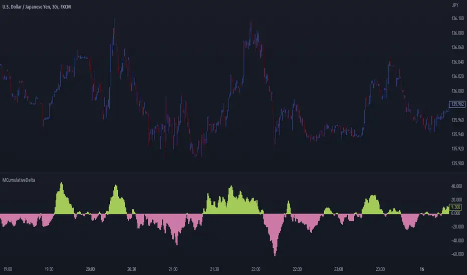
MCumulativeDelta* MCumulativeDelta Indicator *
The MCumulativeDelta Indicator shows the Buying / Selling pressure that is happening in the market. The Delta is powered by the *MBox Precision Delta* Algorithm. This indicator serves to show overall Accumulation and Distribution of the BUYERS and the SELLERS. It becomes possible to gauge if the market is overall Bullish or Bearish. This helps determine trade direction and keeping out of other trades that are counter to what the overall Buying / Selling is showing.
* WHAT THE SCRIPT DOES *
The script draws a histogram that can either be positive or negative. When the histogram is positive it means there are more Buyers in the Market. When the histogram is negative it means there are more sellers in the market. The more positive the histogram gets, the more BUYERS are flooding the market. The more negative the histogram gets, the more SELLERS are flooding the market. When the histogram switches over from negative to positive it is a Bullish sign of Buying. When the histogram switches over from positive to negative, it is a Bearish sign of Selling.
* HOW TO USE IT *
As the histogram becomes more negative, this shows that the SELLERS have taken control of the markets. Conversely, as the histogram becomes more positive, this shows that the Buyers have taken control of the markets. The side that is in control is the direction to generally place trades in, and at the same time filter out trades of the opposite direction.
* HOW IT WORKS *
The MCumulativeDelta histogram on the chart represents overall Buying / Selling. This is the DELTA (difference) between the BUYING and the SELLING. Taking the total BUYING and subtracting the total of SELLING, we produce the DELTA (difference) between the Buying / Selling and this is what is drawn by the histogram.
Unlike other Cumulative Delta indicators which determine delta from the Up / Down wick and just multiply by volume (not a true delta), the MCumulativeDelta indicator uses a sophisticated algorithm that analyzes price movement corresponding to volume movement.
The way the DELTA, BUYING, and SELLING is calculated is computed by the *MBox Precision Delta* Algorithm. The algorithm considers the following data points when making it's computation
1. Price moving up on increasing volume
2. Price moving up on decreasing volume
3. Price moving horizontally on increasing volume
4. Price moving horizontally on decreasing volume
5. Price moving down on increasing volume
6. Price moving down on decreasing volume
Using these data points allows MCumulativeDelta to effectively compute and define the following scenarios
1. Accumulation / Distribution
2. Buying / Selling Exhaustion
3. Buying / Selling EFFORT / NO RESULT
Once the scenario is determined, it will greatly aid in trade decision making. These scenarios are explained in the examples below
* EXAMPLE AND USE CASES *
- Accumulation Example -
When you see a large amount of BUYING (large positive histogram) and price entering an up trend, this is indicative of Accumulation and you would be looking for PULLBACKS to get into the up trend move.
- Distribution Example -
When you see a large amount of SELLING (large negative histogram) and price entering a down trend, this is indicative of Distribution and you would be looking for pullbacks to get into the down trend move.
- Buying EXHAUSTION Divergence -
As price makes higher highs, but the MCumulativeDelta histogram drops (becomes less positive) on the higher highs, it means BUYERS are exhausted. Potentially a reversal or change in behavior in the markets.
- Selling EXHAUSTION Divergence -
As price makes lower lows, but the MCumulativeDelta histogram contracts (becomes less negative) on the lower lows, it means SELLERS are exhausted. Potentially a reversal or change in behavior in the markets.
- BUYING EFFORT / NO RESULT -
As the MCumulativeDelta histogram increases positively, but price fails to make higher highs, it is a sign of EFFORT / NO RESULT on behalf of the Buyers. In this case Buyers are pushing hard to move price up, but are unable to, due to being OVERBOUGHT. If this is accompanied by visible SELLING, it would be a good short entry.
- SELLING EFFORT / NO RESULT -
As the MCumulativeDelta histogram increases negatively, but price fails to make lower lows, it is a sign of EFFORT / NO RESULT on behalf of the Sellers. In this case Sellers are pushing hard to move price down, but are unable to, due to being OVERSOLD. If this is accompanied by visible BUYING, it would be a good long entry.
* SETTING ALERTS *
- FOR CROSSING FROM BUYING TO SELLING OR SELLING TO BUYING -
To be alerted when the histogram crosses over from Buying to Selling (Positive to Negative) or Selling to Buying (Negative to Positive)
1. Right Click Chart -> Add Alert...
2. Select Condition to be "MCumulativeDelta"
3. Select "Crossing" with Value = 0
4. Options set "Once Per Bar Close"
5. Customize Any other Alert Options you want
* AUTHOR *
This script is published by MBoxWave LLC
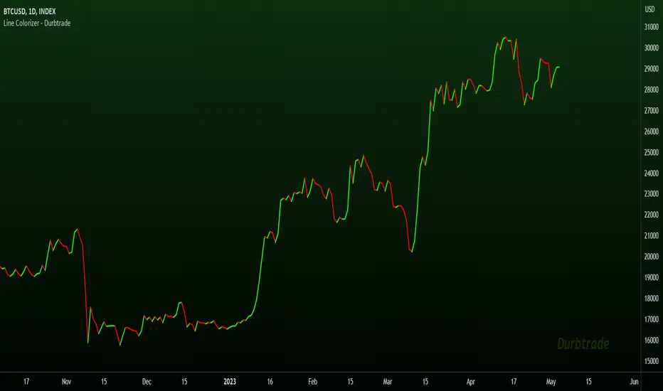
Line Colorizer - DurbtradeThe Line Colorizer is a simple indicator that can plot up/down-colorized lines for up to 10 unique individual sources!
Plot up/down colors are based on whether the current value is above or below the previous value.
Also included is a separate color for when the current value is equal to the previous value.
All colors can be modified, along with the plot styles.
--------------------------------------------
--------------------------------------------
Here is the Inputs tab of the Settings menu :
As you can see, you can plot a colorized line of up to 10 individual sources!
Checking the checkbox turns on that particular colorized plot,
and clicking on the drop down menu allows you select the source for that plot.
The plot styles, up/equal/down colors, and opacities
are customizable under the Style tab within the Settings menu :
Overall, it is pretty easy to use.
--------------------------------------------
Let's look at some examples of the Line Colorizer being used...
Colorize a basic Bollinger Bands indicator :
Want to colorize 3 EMA's? Go for it :
Spice up the standard MACD salad :
Customize the colors of your RSI's :
Try using the Line Colorizer on all of your favorite indicators.
--------------------------------------------
Script Stats :
Pinescript Version : 5
Code Length : 44 Lines
Max Unique Input Sources : 10
Max Visible Plots : 10
Total Colors/Opacities : 30
--------------------------------------------
Tips :
Typically you will want this indicator to be on a layer above (in front of) the source plot layer.
Stay mindful of line thicknesses,
and whether the original source plot is still visible or not.
The final output of the colorized plots are drawn in numerical order,
so, Colorized Source #1 is drawn first, and will appear below Colorized Source #2 on the chart...
and so on, with Colorized Source #10 being drawn last, at the very top.
Final Thoughts :
I like having this indicator.
The idea and script is simple, and the indicator is practical.
It's one method of easily separating some of the aspects of color from your favorite indicators and scripts,
and then customizing those aspects to your liking.
Especially practical for those who do not want to learn about writing their own scripts.
I think that this indicator can be a useful tool in the shed,
used for customizing the visuals of multiple unique sources
that are all on the same price/value scale.
It can help increase chart clarity and/or detail...
whether using it on top of a main chart that is simple,
or on top of a standalone indicator that is crowded with oscillating information.
I hope that you enjoy it and find it useful!
- Please feel free to comment your thoughts, critiques, or suggestions. They are all very helpful!
- Also, please feel free to comment any positive feedback, or awesome screencaps/ideas of the indicator in action!
- Check out my other Pinescript indicators if you like this one... they work well together.
- May your trades be successful!
--------------------------------------------
// Durbtrade
Universal MA Trend(Republishing in Open source)
Hello traders,
Many existing moving average indicators have not been satisfactory in terms of the number, types, and length adjustments of moving averages.
Feeling the inconvenience, I created a moving average indicator and collected numerous famous moving averages.
Fortunately, there was a PineCoder "andre_007" who had already compiled various Moving Averages,
so I was able to find a new Moving Average and combine it with the indicator. Here is the link below
Among these, for the JMA, which has not been publicly disclosed, I utilized the source code from TradingView Wizard everget:
For VIDYA, I also used everget's source code:
And also MAMA / FAMA Coded from Pinescript Wizard everget :
Ehlers MESA Adaptive Moving Averages (MAMA & FAMA)
For Frama, I used the code from nemozny's source code :
Thanks to all these Pinecoders.
---
By using these excellent moving averages together, I found that the simultaneous Up/Down changes of various moving averages with different characteristics tend to be maintained for quite a long time.
Therefore, this indicator not only collects various moving averages but also displays areas with simultaneous trends as background.
An example can be found here:
Furthermore, to prevent the up/down changes of the moving averages due to factors like whipsaws, a smoothing filter has been introduced.
And Also, Alert is able when trend changes.
---
(오픈소스화 후 재발행)
안녕하세요 트레이더여러분.
기존의 이동평균선 지표들은, 이동평균선의 갯수, 종류, 길이조절 등에서 만족스럽지 못한 점들이 많았습니다.
불편함을 느끼고 직접 이동평균선 지표를 만들면서, 유명한 수 많은 이동평균선들을 모았습니다.
그리고 이미 이러한 수많은 이동평균선을 손수 모아서 정리해주신 고마우신 파인코더(andere_007 님)가 있어서, 그 분의 코드를 많이 이용했습니다. 링크는 아래와 같습니다.
이 중 소스가 공개되지 않은 이동평균선 중 JMA는 트레이딩뷰 위자드이신 everget의 소스코드를 이용했습니다.
VIDYA 역시 everget의 소스코드를 이용했습니다.
MAMA와 FAMA의 코드 역시 everget님의 코드를 가져왔습니다.
Ehlers MESA Adaptive Moving Averages (MAMA & FAMA)
Frama는 nemozny님의 코드를 이용했습니다.
의 코드를 이용했습니다.
이 자리를 빌어 위의 파인코더님들께 감사의 말씀을 전합니다.
---
이러한 좋은 이동평균선을 모아서 사용해보니, 다양한 특성을 갖고 있는 이동평균선의 동시적인 Up/Down 변화는 꽤 오랫동안 유지된다는 점을 발견했습니다.
그래서 이 지표는, 위의 여러가지 이동평균선을 모아놓은 것 뿐만 아니라,
그것에서 동시적인 트랜드가 나오는 곳을 배경화면으로 표시해두었습니다.
예시는 다음과 같습니다.
나아가 휩쏘 등으로 이동평균선의 up/down이 바뀌는 것을 막고자, Smoothing 필터도 도입했습니다.
또한 트랜드가 바뀔 때 얼러트가 울리도록, 얼러트 기능을 설정해놓을 수 있게 해놓았으며, 현재 이동평균선과 상태를 보기 쉽도록 테이블을 만들어놓았습니다.

Ectopic Bar by Moti RakamEctopic Bar is an indicator that highlights a pin-bar candle that has divergence in it's shape and volume delta. To find volume delta, code of standard Up/Down volume indicator has been used.
PIN BAR : pin bar are marked by using Close Range option parameter. Default value is set to 0.35 which implies any candle that closes in the 35% of its high/low will be considered a pin bar (of course the code also ensures that rest of the bar body is only a wick).
HOW IT WORKS:
Up/Down volume variables "Up Volume" and "Down Volume" are checked against the shape of the pin bar to find an ectopic situation. For example, if a bullish pin bar candle (a bullish hammer) has more sell volume than buy volume, that's an ectopic situation. The bullish hammer shows a buying push from the bottom of the wick, instead the up/down volume indicator shows there were more sell orders than buy orders. Hence the ectopic situation. Similarly, an inverted hammer (a bearish hammer) in general should have more sell volume, but instead if it has more buying volume, the indicator highlights it as an ectopic bar.
Ectopic Bars are painted in yellow colour.

Multi-Timeframe Trend IndicatorThe Multi-Timeframe Trend Indicator (MTFTI) is a trend analysis tool designed to help traders quickly and easily assess the market direction across multiple timeframes. With the help of a table to visualize the trends on different timeframes.
Key features:
Multi-timeframe trend indicator for the following timeframes: 5 minutes, 15 minutes, 30 minutes, 1 hour, 2 hours, 4 hours, 6 hours, 12 hours, 1 day, and 1 week and average.
Displays trends for selected timeframes in a table.
Considers short and long-term exponential moving averages (EMAs) to determine trends.
Calculation of the average trend for all timeframes.
Display of trends with appropriate coloring for better readability (green for "Up", red for "Down", and intermediate shades for neutral or strong trends).
List of Parameters
Customization of the table's position on the screen (top-left, top-right, middle-left, middle-right, bottom-left, bottom-right).
Setting the lengths of the short and long-term exponential moving averages.
Option to activate or deactivate the display of EMAs for better customization (true by default).
Please note that the MTFTI is not a guarantee of future market performance and should be used in conjunction with proper risk management. Always ensure that you have a thorough understanding of the indicator’s methodology and its limitations before making any investment decisions. Additionally, past performance is not indicative of future results.
Range Analysis - By LeviathanThe Interactive Range Analysis script is an essential tool for analyzing price ranges. It automatically draws important range levels, generates a Volume Profile or Open Interest profile and horizontal/vertical heatmaps, plots the anchored VWAP, draws Fibonacci levels, and much more.
How to use the indicator:
1. The script will prompt you to select the "Start Time" and "End Time" using Tradingview's interactive interface. These two points will determine the length of the range.
2. Once you have selected the range, the script will automatically anchor the range highs and lows to the highest and lowest close/wick/hlc3/ohlc4 (whichever you prefer).
3. You can then begin exploring different tools and options such as Quarters, Eighths, Fibonacci, Outer Levels, VWAP, Horizontal Volume/OI Heatmap, Vertical Volume/OI Heatmap, Fixed Range Volume Profile, Open Interest Profile, Value Area, VAH, VAL, and POC.
4. You can adjust the range by dragging the Start Time and End Time anchors or by removing/reapplying the script.
Tool overview
Range Levels
After selecting your preferred time range, the script will identify and draw a range high level and a range low level, which serve as a base for other important levels. “Half” is the level halfway between the range high and range low. “Quarters” will, as the name suggests, split the range into four equal zones (quarters) and “Eighths” will split the range into eight equal zones (eighths).
”Fibonacci” option allows you to display Fibonacci retracement levels (0.786, 0.618, 0.382, 0.236). “VWAP” will plot a Volume Weighted Average Price, anchored to the start of the range. “Direction” input lets you choose whether your range is UP or DOWN trending in order to make sure that the Fibonacci levels and labels are generated and assigned correctly. With “Outer” turned ON, the script will also generate active levels (quarters/eighths/Fibonacci) above and below the selected price range. “Extend Right” will extend all levels to the right indefinitely, while “Extend (+Bars)” lets you choose how far right the levels get extended. “Diagonal Line” is drawn from the bottom left of the range to the top right of the range or from the top left of the range to the bottom right of the range, depending on the “Direction” input.
Volume Profile / Open Interest Profile
After selecting the “Data Type”, Volume Profile or OI Profile can be generated by turning ON the “Volume/OI Profile” option.
“Resolution” input defines the amount of nodes/rows in the range that are used in profile/heatmap generation for distributing the data. While you can increase the “Resolution” to get better, more granular profiles, you should keep in mind that you might need to lower the resolution when generating profiles for larger ranges.
”Node Type” offers you two options when it comes to the representation of data: Up/Down - divides a node in two sections for up volume/OI and down volume/OI, Total - one node for total volume/OI and Delta - net difference in up volume/OI and down volume/OI.
”Profile Position” lets you choose whether the profile is positioned on the left side of the range or on the right side of the range.
“Profile Direction” determines whether the profile nodes are facing right or left.
“Profile Type” enables you to visualize the nodes in a classic way (Type 1) or in a way where down volume/negative OI are positioned on the left side of the y axis and up volume/positive OI on the right side of the y axis.
“Node Size (%)” defines how much space in the range can be taken by the profile’s nodes. Eg. 50% will allow the largest node to extend to the middle of the range (and others scaled accordingly), 100% will allow the largest node to extend the max right point of the range (and others scaled accordingly).
”Value Area (%)” defines the VA zone, which represents the area where the most volume occured (usually 70% or 68%).
”Horizontal Heatmap” will display a heatmap-like overlay, that will help you identify the price levels where most volume/open interest action occurred.
”Vertical Heatmap” will display a heatmap-like overlay, that will help you identify the points in time where most volume/open interest action occurred.
A more detailed description of this indicator is coming in the next few days.
Important:
* If volume or OI profile does not get generated, try lowering the resolution.
* Once in a while, the script will disappear from your chart. Just remove and reapply.
* Open Interest data is only avaiable on Binance Perpetual Futures pairs
To learn more, read the tooltips in the indicator’s settings and stay tuned for upcoming additions (Range Market Structure, Liquidation Levels, Range Statistics,…)
Ross Givens VolumeVolume is probably the most overlooked indicator by new traders. The buying and selling activity of large funds and institutions is the main driver of stock prices, and recognizing this activity is crucial to identifying future price movements.
This script has several elements not found in standard volume indicators:
POCKET PIVOTS
Pocket Pivots are the work of Gil Morales and Chris Kacher - authors of "Trade Line an O'Neil Disciple."
A pocket pivot is an up day with volume that is greater than the highest down volume day of the last 10 down days. These are also referred to as "10-day pocket pivots ."
A pocket pivot is not a buy signal by itself. But this is a constructive sign for a stock coming out of a base or wedging pattern. When a stock is trading in a tight consolidation range and then breaks out above resistance to a new high, I like to see a pocket pivot to give confirmation for the move.
VOLUME MOVING AVERAGE
There is a simple moving average applied to the volume chart. By default, it is set to a period of 50.
This line is a quick way to see how much volume a stock sees on average and whether or not the current volume is above or below that level. The moving average is white by default, so you will want to change the color if your charts have a light background.
HIGHEST UP VOLUME IN A YEAR
When a stock sees its highest up volume in a year or more, this is a strong indication of heavy institutional buying. This script looks back at the last 252 daily candles (there are 252 trading days in a year) and paints the candle fucshia if it has the highest up day volume over that period.
The color and time period can be changed in the settings. Volume on down days are not factored into the equation since we are only looking for the heaviest buying day of the last year.
NOTE: This feature will only display on a daily chart.
UP/DOWN VOLUME RATIO
The up/down volume ratio compares up versus down volume . Specifically, it calculates the total volume on advancing days vs the total volume on declining days over the last 50 sessions.
The ratio is displayed in a small table in the upper right corner of the volume indicator panel. A ratio above 1.0 is a bullish sign and will paint the cell green, while a ratio below 1.0 will paint red as a bearish signal.
AVERAGE $ VOLUME
Another cell in the upper right corner of the indicator displays the average daily trading volume in dollars. This is simply the average daily volume multiplied by the price of the stock.
The Average $ Volume will quickly tell you how much money trades through a stock in a given day. Investors trading larger size can see if the stock is too thin to handle their usual position size.
VOLUME COLORS
- Pocket pivots are BRIGHT GREEN
- Regular up volume days are GREEN
- Down volume days are RED
You have the option to change these colors in the settings. You can also toggle on or off the Moving Average, Pocket Pivots , Highest Volume Up Day, U/D ratio, and Avg $ Vol.
Please leave any questions you have in the comment section and I will do my best to answer them.

Footprint ClassicThe Volume Footprint chart is analyzing volume data contained within candles and split it into two components - Up and Down volume. This analysis is similar to how Volume Profile evaluates volume data from a portion of the chart.
This script can be used by any user. You do not need to have PRO or PREMIUM account to use it.
As a user, you have the flexibility to select the desired level of data precision for the Volume Footprint analysis. We highly recommend using the highest precision possible, as it provides the most accurate results. However, it's important to keep in mind that Trading View has several limitations and not all levels of precision are available on all intervals. The higher the precision, the shorter the history of available data.
If, after adding the script or changing the precision, you encounter an error message stating "'The study references too many candles in history'", it may be necessary to reduce the precision level in the script settings to resolve the issue.
This script is a part of the "Volume Footprint" toolkit, which includes:
I. Footprint chart visualization scripts in two variants:
⠀⠀Volume Footprint - Presenting volume data on both sides of the candle.
⠀⠀Volume Footprint Classic - Presenting volume data on the right side of the candle.
II. Supporting tools:
⠀⠀Volume Footprint Statistics - Script presents, in tabular form, basic statistics calculated from candle volume data, such as Delta, min Delta, max Delta and more. It can support both Volume Footprint and Volume Footprint Classic.
⠀⠀Volume Footprint Candles - Tool drawing candles adapted for footprint chart scripts.
III. Tools dedicated to more detailed analysis:
⠀⠀Volume Delta - A candle chart illustrating changes in delta values.
⠀⠀Volume Cumulative Delta - A candle chart ilustrating changes in cumulative delta values.
⠀⠀Volume Delta In Candle - A line chart showing changes in delta values over a period equal to the chart interval.
⠀⠀Volume Cumulative Delta in Interval - A line chart showing changes in cumulative delta over a period equal to the chart interval.
Script with limited access, contact author to get authorization
User Interface:
The script groups Up and Down volume into slots based on price. The height of the slots is controlled by the "Slot height" parameter in the settings. Each slot has the following configurable features:
Text - A label that displays the value. You can choose from:
⠀- - Hidden
⠀V - Slot Volume (UP + Down)
⠀V% - Slot volume as percentage of Candle volume
⠀UD - Up and Down volume
⠀UDI - Up and Down volume + Imbalance symbols.
⠀Δ - Delta (Up - Down Volume)
⠀Δ% - Delta as percent of slot volume (from -100% to 100%)
Border - Highlight slots with border color. You can chose from:
⠀- - Hidden
⠀C - Constant color
⠀POC - Slot with biggest volume
⠀V - Slot volume compared to other slots in that candle
⠀VA - Value area, highlights slots forming the value area
⠀Δ - Delta is the slot.
Background - Highlight slots with background color. You can pick one of:
⠀- - Hidden
⠀C - Constant color
⠀POC - Slot with biggest volume
⠀V - Slot volume compared to other slots in that candle
⠀VA - Value area, highlights slots forming the value area
⠀Δ - Delta is the slot.
Imbalances symbols:
Before the Down Volume, the following imbalance symbols may appear:
⠀↓ - 3 times
⠀↡ - 5 times
⠀⇊ - 10 times
After the Up Volume the following imbalance symbols may appear:
⠀↑ - 3 time
⠀↟ - 5 times
⠀⇈ - 10 times
Above the candle, the following basic statistics can be shown:
"V:" - Row with volume statistics:
⠀∑ - Total volume ,
⠀Δ - Difference between Up and Down Volume .
⠀min Δ - The smallest difference between Up and Down Volume in that candle
⠀max Δ - the biggest difference between Up and Down Volume in that candle
Script settings:
Slot height = 10^ - Price slot height on the chart, recorded as a power of 10, which means:
⠀ 0 - 1$
⠀ 1 - 10$
⠀ 2 - 100$
⠀ 3 - 1000$
⠀-1 - 0.1$
⠀-2 - 0.01$
⠀-3 - 0.001$
Data precision - One of 6 standard levels of data precision: ▉▇▆▅▃▁, where ▉ means the highest precision and ▁ the lowest available precision and two special values "W" and "M" dedicated for biggest intervals. The highest precision should be available for 15-minute chart, but for a 1D chart, it may hit TradingView limitations and the script will not be launched by the platform with error: "'The study references too many candles in history'". The general recommendation is to use the highest available precision for a given instrument and interval.
Precise warnings - An option to show warnings about missing volume in candle footprint (warning connected with one of TradingView limitations).
Text - Picking what king of info is on label:
⠀- - Hidden
⠀V - Total slot Volume
⠀V% - Slot volume as % of Candle volume
⠀UD - Up and Down volume
⠀UDI - Up and Down volume + Imbalance symbols.
⠀Δ - Delta
⠀Δ% - Delta as percent of slot volume
Centered - If checked volume labels are stick to candle (centered), if not they are alligned to right.
Border, Background:
⠀- - Hidden
⠀C - Color1
⠀POC - Slot with biggest volume
⠀V - Slot volume compared to other slots in that candle
⠀VA - Value area, highlights the slots forming the value area
⠀Δ - Delta is the slot, color1 is used when volume Up is at least 10% bigger, color2 is used when Volume Down is at least 10% bigger
Filter - Filtering option than allow hinding labels with small values:
⠀0 - filter turned off.
⠀1-5 - filtering with transparency
⠀6-10 - Filtering with hiding values
Show zeros - Option to show zeros or leave empty spaces
Draw candles - Option to draw candles that fit the volume labels, and 2 fields to choose the color of up and down candles. It is recommended to hide chart candles and use candles adapted to the footprint chart. TradingView has a bug and candles are drawn under the slots. If you choose a non-transparent background or border, they may be invisible. If possible (free accounts have a limit of 3 scripts), it is recommended to use Volume Footprint Candles script to draw thin candles over the slots.
Show stats - Showing stats over the candle: ∑, Δ, min Δ, max Δ. It's recommended to use 'Volume Footprint Statistics' script instead
Font size - Used to draw stats over the chart: T(iny), S(mall), N(ormal), L(arge)
Instrument and Volume status - A dialog showing basic chart information: Instrument type, Volume type, Smallest change, slot height.
Value area - Value area is the smallest group set of neighboring slots that have at least n(param) % of candle volume.
⠀ Value Area Minimal Volume (%) - Value area size as % of candle volume
⠀ Track - Option to track value areas, potencial support-resistance zones.
⠀ Only active - Option to hide areas that were crossed by the price.
⠀ Show Values - Opiton to show volume value over tracked value areas.
Alerts:
⠀ One alert per Bar - Emits no more than one alert per bar.
⠀ Add value area to tracking - Emits an alert about a new VA beeing added to the tracking list.
⠀ Remove value area from tracking - Emits an alert when a VA is removed from the tracking list.
Troubleshooting:
In case of any problems, please send error details to the author of the script.
Known issues:
"The study references too many candles in history" - If you encounter this issue, try changing "Data precision" setting to a lower value.

Dynamo
╭━━━╮
╰╮╭╮┃
╱┃┃┃┣╮╱╭┳━╮╭━━┳╮╭┳━━╮
╱┃┃┃┃┃╱┃┃╭╮┫╭╮┃╰╯┃╭╮┃
╭╯╰╯┃╰━╯┃┃┃┃╭╮┃┃┃┃╰╯┃
╰━━━┻━╮╭┻╯╰┻╯╰┻┻┻┻━━╯
╱╱╱╱╭━╯┃
╱╱╱╱╰━━╯
Overview
Dynamo is built to be the Swiss-knife for price-movement & strength detection, it aims to provide a holistic view of the current price across multiple dimensions. This is achieved by combining 3 very specific indicators(RSI, Stochastic & ADX) into a single view. Each of which serve a different purpose, and collectively provide a simple, yet powerful tool to gauge the true nature of price-action.
Background
Dynamo uses 3 technical analysis tools in conjunction to provide better insights into price movement, they are briefly explained below:
Relative Strength Index(RSI)
RSI is a popular indicator that is often used to measure the velocity of price change & the intensity of directional moves. RSI computes the relative strength of the current price by comparing the security’s bullish strength versus bearish strength for a given period, i.e. by comparing average gain to average loss.
It is a range bound(0-100) variable that generates a bullish reading if average gain is higher, and a bullish reading if average loss is higher. Values over 50 are generally considered bullish & values less than 50 indicate a bearish market. Values over 70 indicate an overbought condition, and values below 30 indicate oversold condition.
Stochastic
Stochastic is an indicator that aims to measure the momentum in the market, by comparing most recent closing price of the security to its price range for a given period. It is based on the assumption that price tends to close near the recent high in an up trend, and it closes near the recent low during a down trend.
It is also range bound(0-100), values over 80 indicate overbought condition and values below 20 indicate oversold condition.
Average Directional Index(ADX)
ADX is an indicator that can quantify trend strength, it is derived from two underlying indices, known as Directional Movement Index(DMI). +DMI represents strength of the up trend, and -DMI represents strength of the down trend, and ADX is the average of the two.
ADX is non-directional or trend-neutral, which means, it does not follow the direction of the price, instead ADX will rise only when there is a strong trend, it does not matter if it’s an up trend or a down trend. Typical ranges of ADX are 25-50 for a strong trend, anything below 25 is considered as no trend or weak trend. ADX can frequently shoot upto higher values, but it generally finds exhaustion levels around the 60-75 range.
About the script
All these indicators are very powerful tools, but just like any other indicator they have their limitations. Stochastic & ADX can generate false signals in volatile markets, meaning price wouldn’t always follow through with what’s being indicated. ADX may even fail to generate a signal in less volatile markets, simply because it is based on moving averages, it tends to react slower to price changes. RSI can also lose it’s effectiveness when markets are trending strong, as it can stay in the overbought or oversold ranges for an extended period of time.
Dynamo aims to provide the trader with a much broader perspective by bringing together these contrasting indicators into a single simplified view. When Stochastic becomes less reliable in highly volatile conditions, one can cross validate their deduction by looking at RSI patterns. When RSI gets stuck in overbought or oversold range, one can refer to ADX to get better picture about the current trend. Similarly, various combinations of rules & setups can be formulated to get a more deterministic view, when working with either of these indicators.
There many possible use cases for a tool like this, and it totally depends on how you want to use it. An obvious option is to use it to trigger signals only after it has been confirmed by two or more indicators, for example, RSI & Stochastic make a great combination for cross-over or cross-under strategies. Some of the other options include trend detection, strength detection, reversals or price rejection points, possible duration of a trend, and all of these can very easily be translated into effective entry and exit points for trades.
How to use it
Dynamo is an easy-to-use tool, just add it to your chart and you’re good to start with your market analysis. Output consists of three overlapping plots, each of which tackle price movement from a slightly different angle.
Stochastic: A momentum indicator that plots the current closing price in relation to the price-range over a given period of time.
Can be used to detect the direction of the price movement, potential reversals, or duration of an up/down move.
Plotted as grey coloured histograms in the background.
Relative Strength Index(RSI): RSI is also a momentum indicator that measures the velocity with which the price changes.
Can be used to detect the speed of the price movement, RSI divergences can be a nice way to detect directional changes.
Plotted as an aqua coloured line.
Average Directional Index(ADX): ADX is an indicator that is used to measure the strength of the current trend.
Can be used to measure how strong the price movement is, both up and down, or to establish long terms trends.
Plotted as an orange coloured line.
Features
Provides a well-rounded view of the market movement by amalgamating some of the best strength indicators, helping traders make better informed decisions with minimal effort.
Simplistic plots that aim to convey clean signals, as a result, reducing clutter on the chart, and hopefully in the trader's head too.
Combines different types of indicators into a single view, which leads to an optimised use of the precious screen real-estate.
Final Note
Dynamo is designed to be minimalistic in functionality and in appearance, as it is being built to be a general purpose tool that is not only beginner friendly, but can also be highly-configurable to meet the needs of pro traders.
Thresholds & default values for the indicators are only suggestions based on industry standards, they may not be an exact match for all markets & conditions. Hence, it is advisable for the user to test & adjust these values according their securities and trading styles.
The chart highlights one of many possible setups using this tool, and it can used to create various types of setups & strategies, but it is also worth noting that the usability & the effectiveness of this tool also depends on the user’s understanding & interpretation of the underlying indicators.
Lastly, this tool is only an indicator and should only be perceived that way. It does not guarantee anything, and the user should do their own research before committing to trades based on any indicator.

Bar metrics / quantifytools— Overview
Rather than eyeball evaluating bullishness/bearishness in any given bar, bar metrics allow a quantified approach using three basic fundamental data points: relative close, relative volatility and relative volume. These data points are visualized in a discreet data dashboard form, next to all real-time bars. Each value also has a dot in front, representing color coded extremes in the values.
Relative close represents position of bar's close relative to high and low, high of bar being 100% and low of bar being 0%. Relative close indicates strength of bulls/bears in a given bar, the higher the better for bulls, the lower the better for bears. Relative volatility (bar range, high - low) and relative volume are presented in a form of a multiplier, relative to their respective moving averages (SMA 20). A value of 1x indicates volume/volatility being on par with moving average, 2x indicates volume/volatility being twice as much as moving average and so on. Relative volume and volatility can be used for measuring general market participant interest, the "weight of the bar" as it were.
— Features
Users can gauge past bar metrics using lookback via input menu. Past bars, especially recent ones, are helpful for giving context for current bar metrics. Lookback bars are highlighted on the chart using a yellow box and metrics presented on the data dashboard with lookback symbols:
To inspect bar metric data and its implications, users can highlight bars with specified bracket values for each metric:
When bar highlighter is toggled on and desired bar metric values set, alert for the specified combination can be toggled on via alert menu. Note that bar highlighter must be enabled in order for alerts to function.
— Visuals
Bar metric dots are gradient colored the following way:
Relative volatility & volume
0x -> 1x / Neutral (white) -> Light (yellow)
1x -> 1.7x / Light (yellow) -> Medium (orange)
1.7x -> 2.4x / Medium (orange) -> Heavy (red)
Relative close
0% -> 25% / Heavy bearish (red) -> Light bearish (dark red)
25% -> 45% / Light bearish (dark red) -> Neutral (white)
45% - 55% / Neutral (white)
55% -> 75% / Neutral (white) -> Light bullish (dark green)
75% -> 100% / Light bullish (dark green) -> Heavy bullish (green)
All colors can be adjusted via input menu. Label size, label distance from bar (offset) and text format (regular/stealth) can be adjusted via input menu as well:
— Practical guide
As interpretation of bar metrics is highly contextual, it is especially important to use other means in conjunction with the metrics. Levels, oscillators, moving averages, whatever you have found useful for your process. In short, relative close indicates directional bias and relative volume/volatility indicates "weight" of directional bias.
General interpretation
High relative close, low relative volume/volatility = mildly bullish, bias up/consolidation
High relative close, medium relative volume/volatility = bullish, bias up
High relative close, high relative volume/volatility = exuberantly bullish, bias up/down depending on context
Medium relative close, low relative volume/volatility = noise, no bias
Medium relative close, medium to high relative volume/volatility = indecision, further evidence needed to evaluate bias
Low relative close, low relative volume/volatility = mildly bearish, bias down/consolidation
Low relative close, medium relative volume/volatility = bearish, bias down
Low relative close, high relative volume/volatility = exuberantly bearish, bias down/up depending on context
Nuances & considerations
As to relative close, it's important to note that each bar is a trading range when viewed on a lower timeframe, ES 1W vs. ES 4H:
When relative close is high, bulls were able to push price to range high by the time of close. When relative close is low, bears were able to push price to range low by the time of close. In other words, bulls/bears were able to gain the upper hand over a given trading range, hinting strength for the side that made the final push. When relative close is around middle range (40-60%), it can be said neither side is clearly dominating the range, hinting neutral/indecision bias from a relative close perspective.
As to relative volume/volatility, low values (less than ~0.7x) imply bar has low market participant interest and therefore is likely insignificant, as it is "lacking weight". Values close to or above 1x imply meaningful market participant interest, whereas values well above 1x (greater than ~1.3x) imply exuberance. This exuberance can manifest as initiation (beginning of a trend) or as exhaustion (end of a trend):